essntl
Brand identity system
A brand for the human way to get good at AI. Essential, said in full, written with the vowels left out. What’s left points up.
The brief
essntl.ai helps non-tech UK companies under 200 people actually use AI. The buyers are CEOs and CFOs who have heard enough hype: they want cost, evidence and someone responsible.
The name had to read as “essential” at a glance, survive a phone call and a 16px favicon, and stay clear of the category’s clichés: no nodes, no glowing gradients, no robots, no sparkles.
The mark
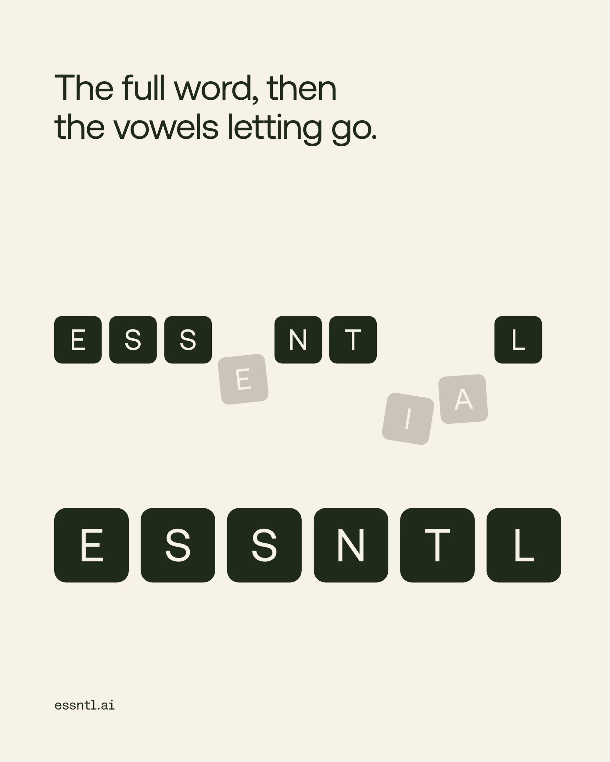
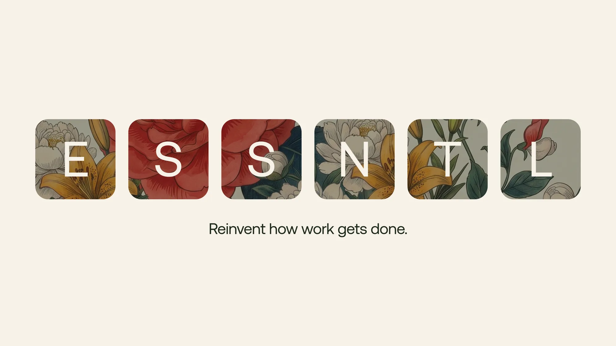
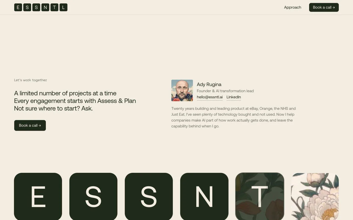
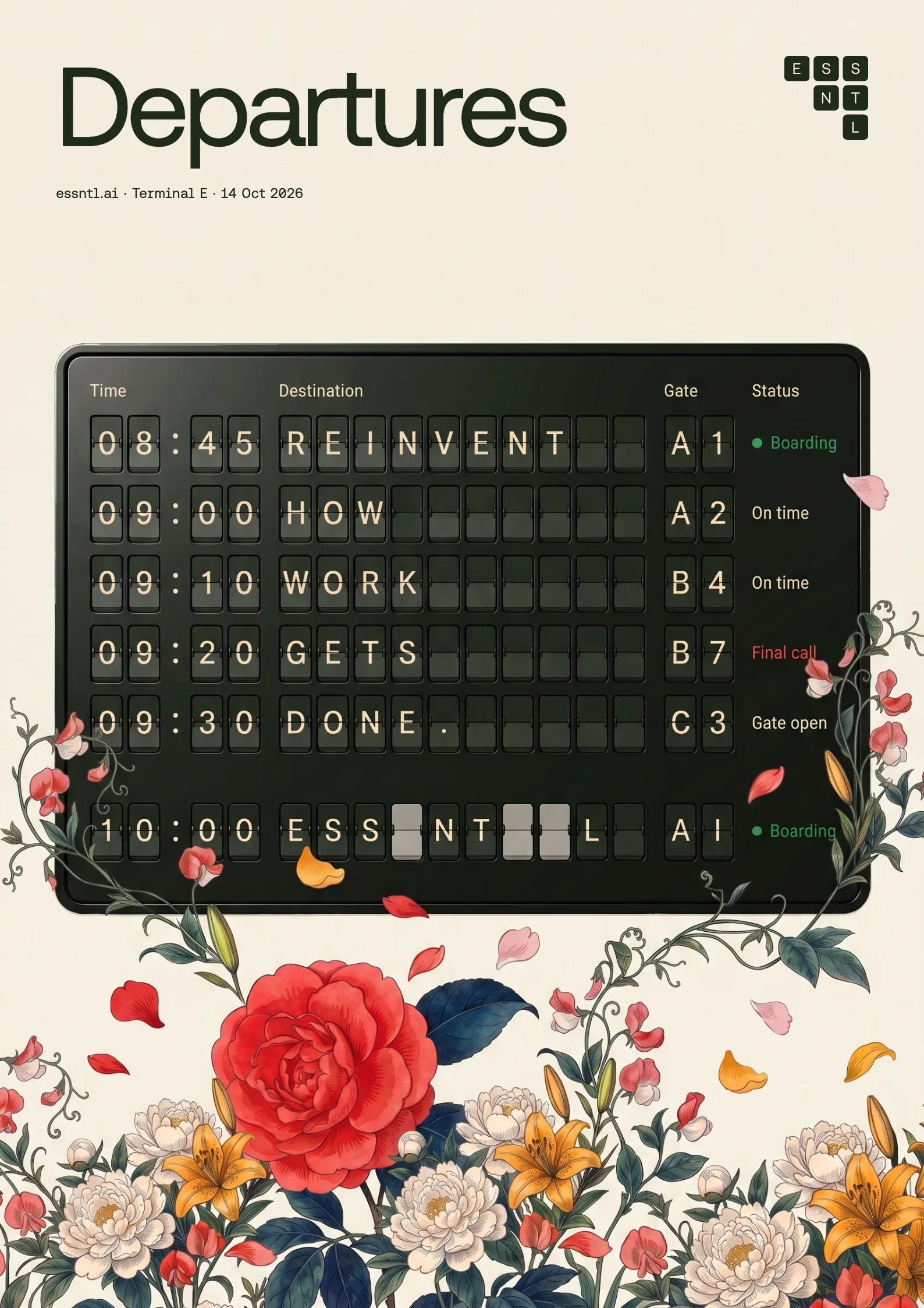
Six tiles: E S S N T L. In motion the board flips to ESSENTIAL, the vowels turn grey and let go, and the row closes up.
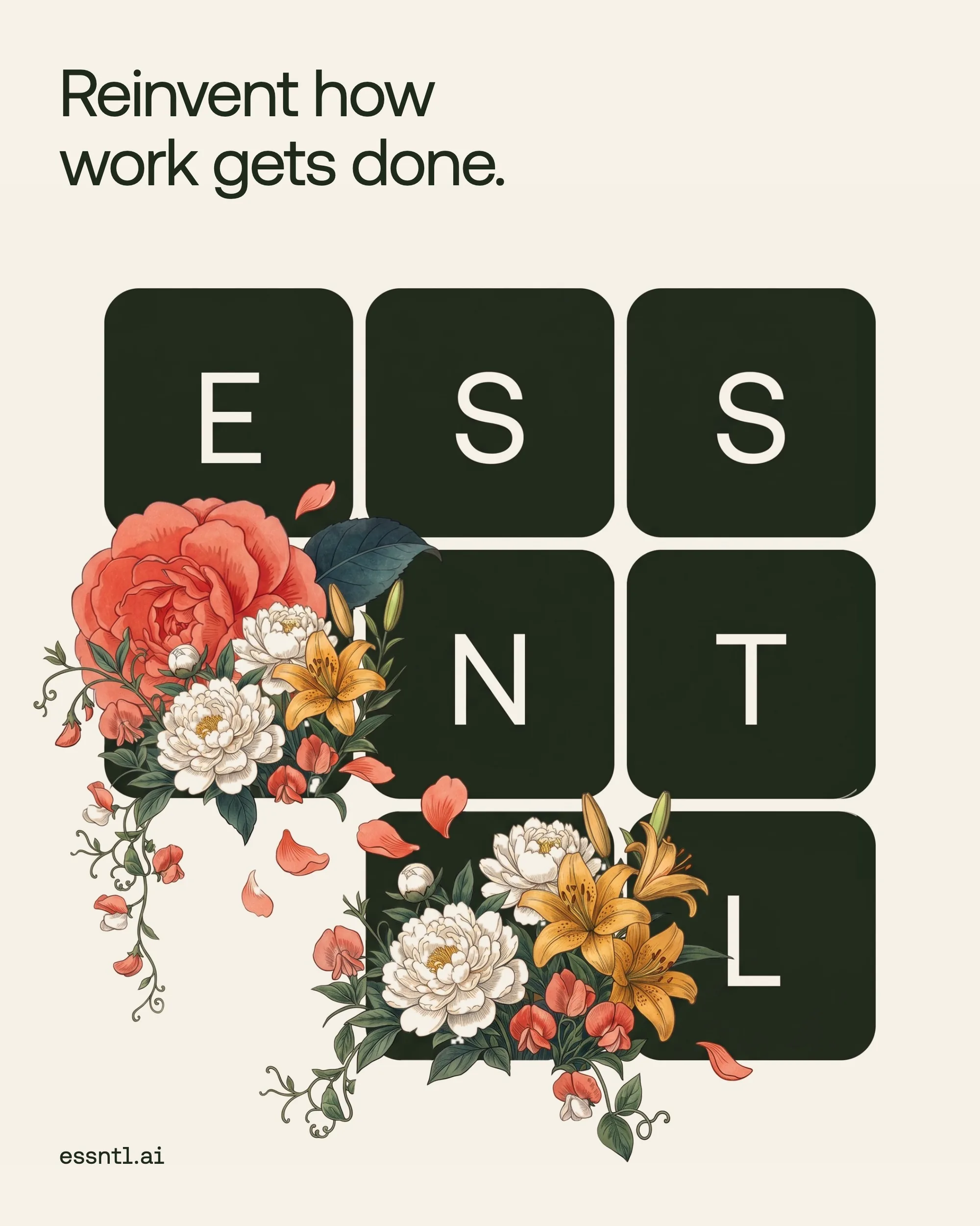
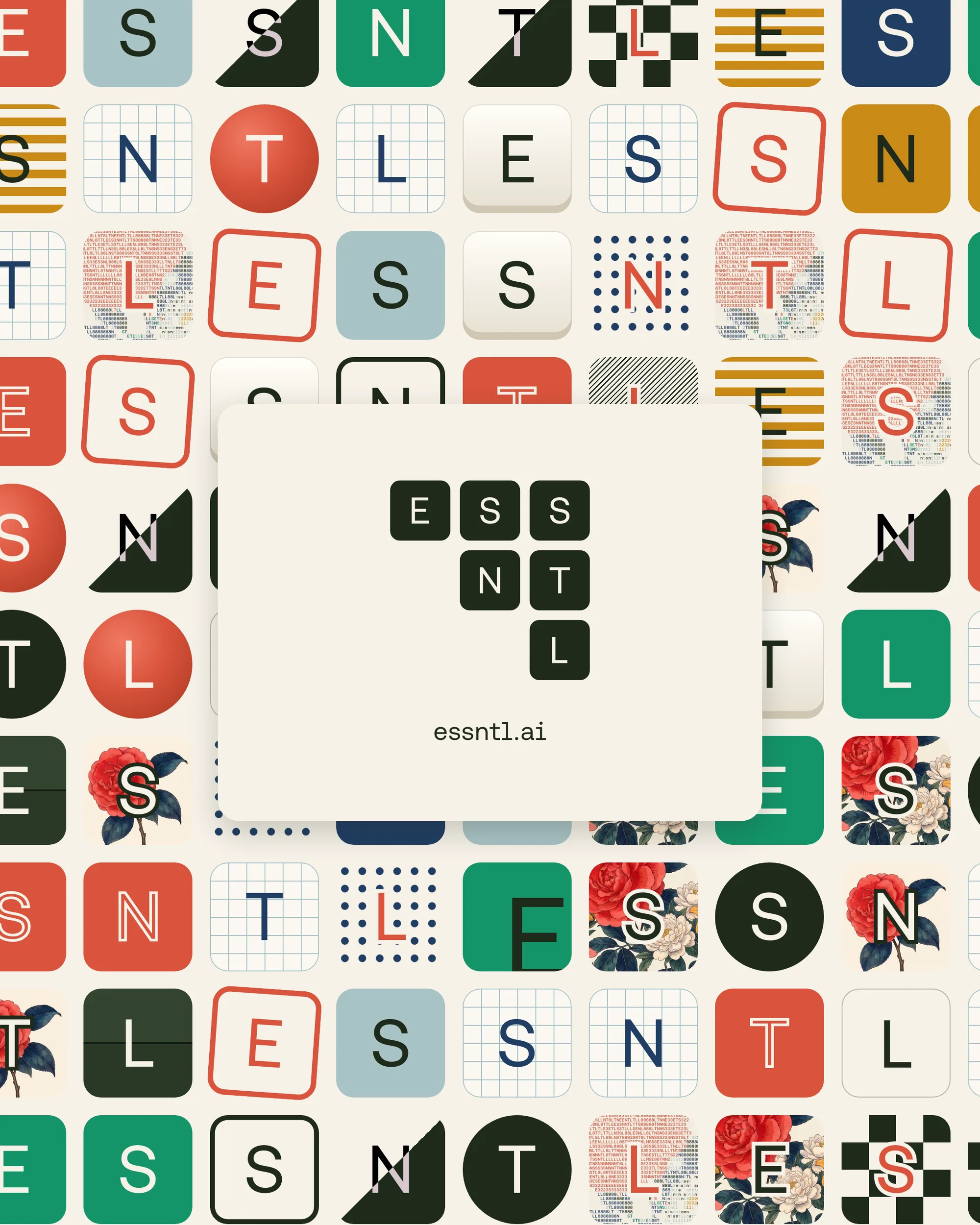
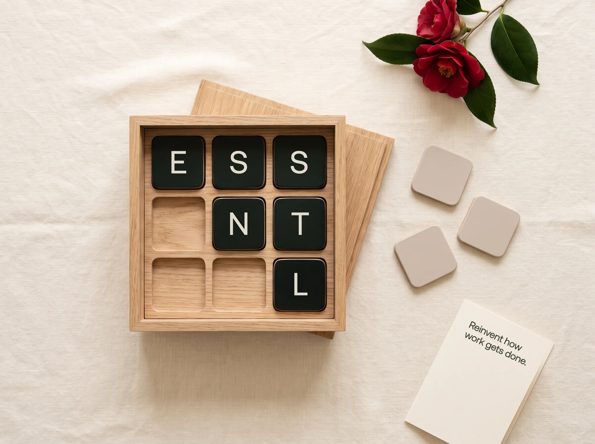
On a 3 × 3 grid the empty bottom-left corner turns the square into an arrow pointing up. The tiles carry the rest of the system: a camellia built from them, and a set of skins for play.
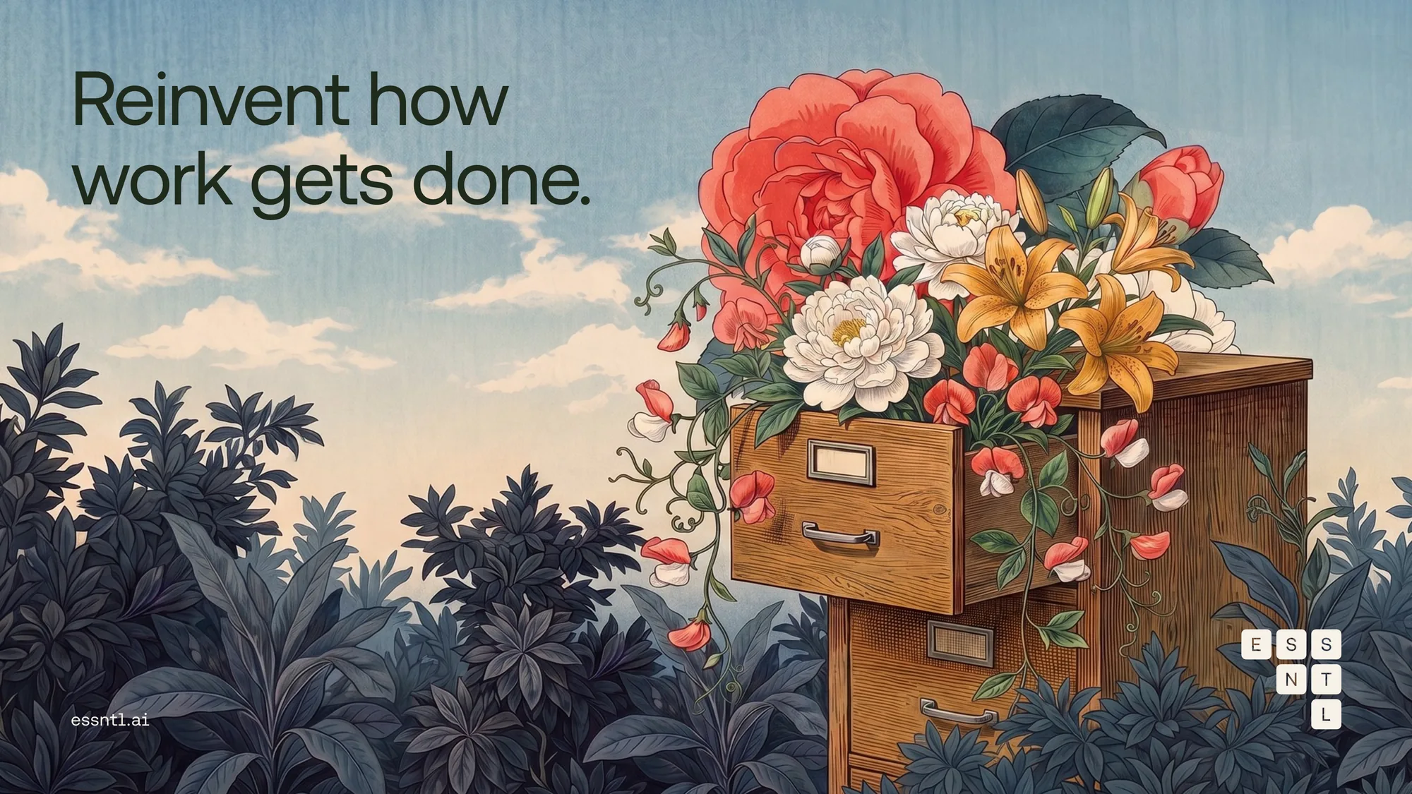
Japanese botanical engraving
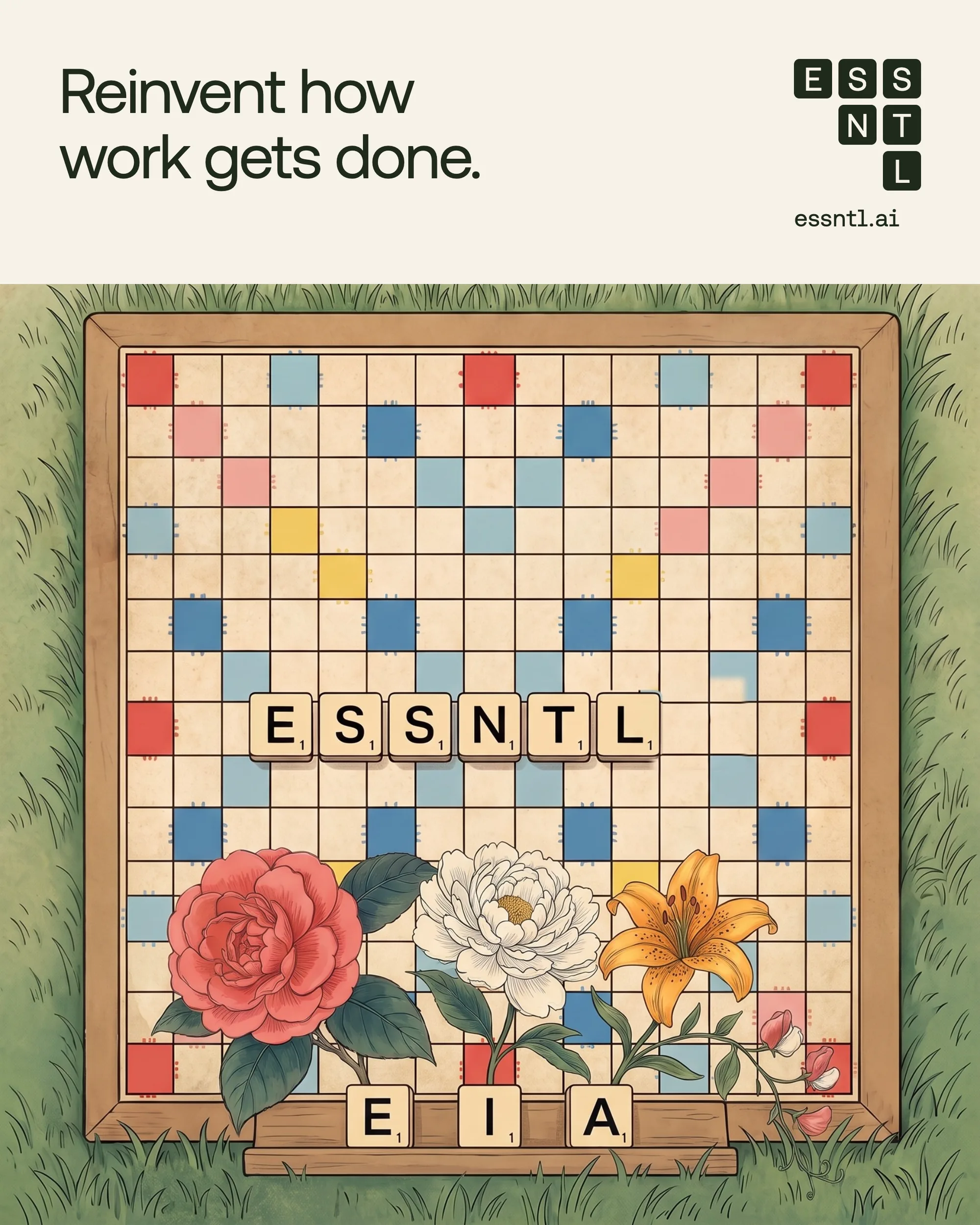
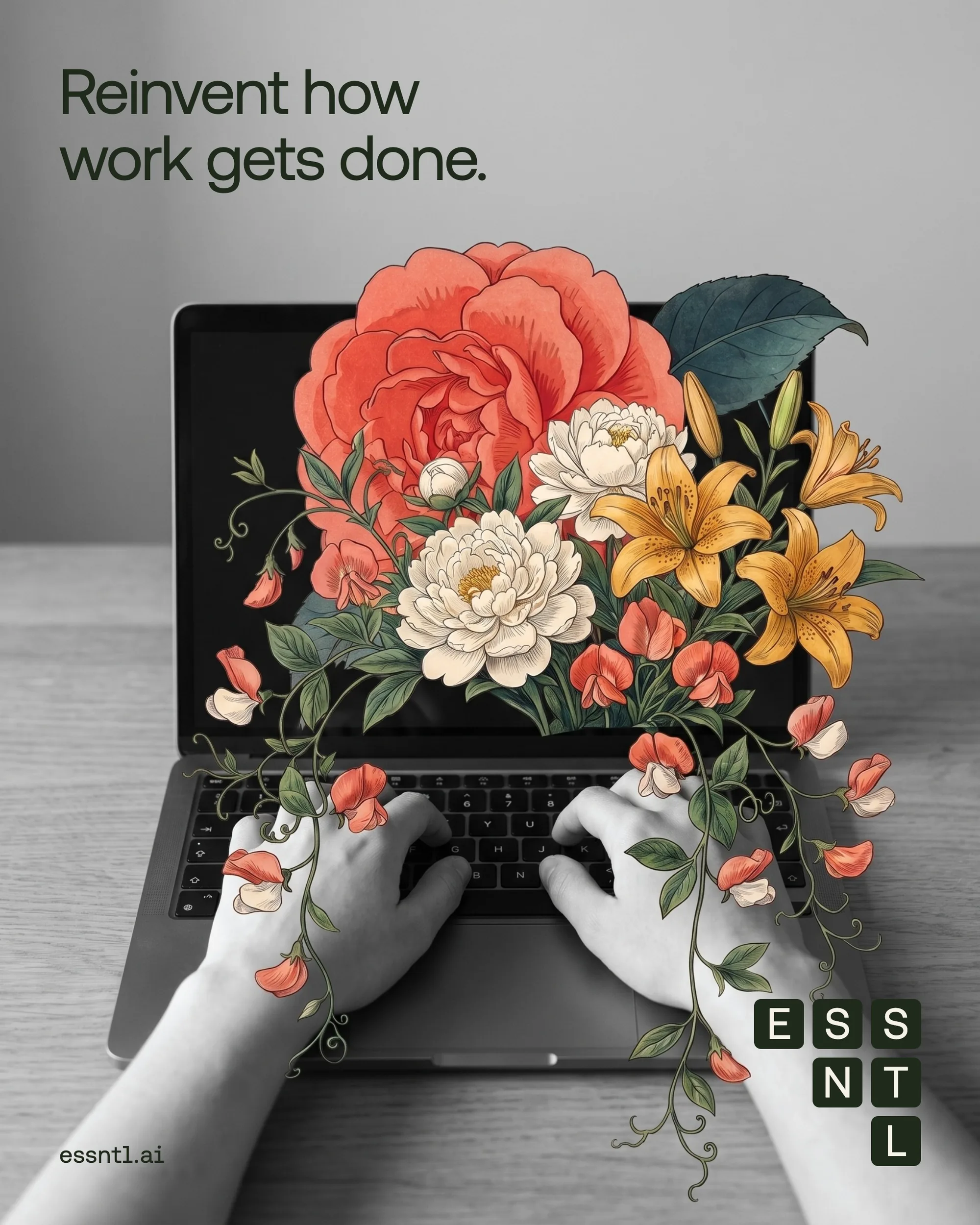
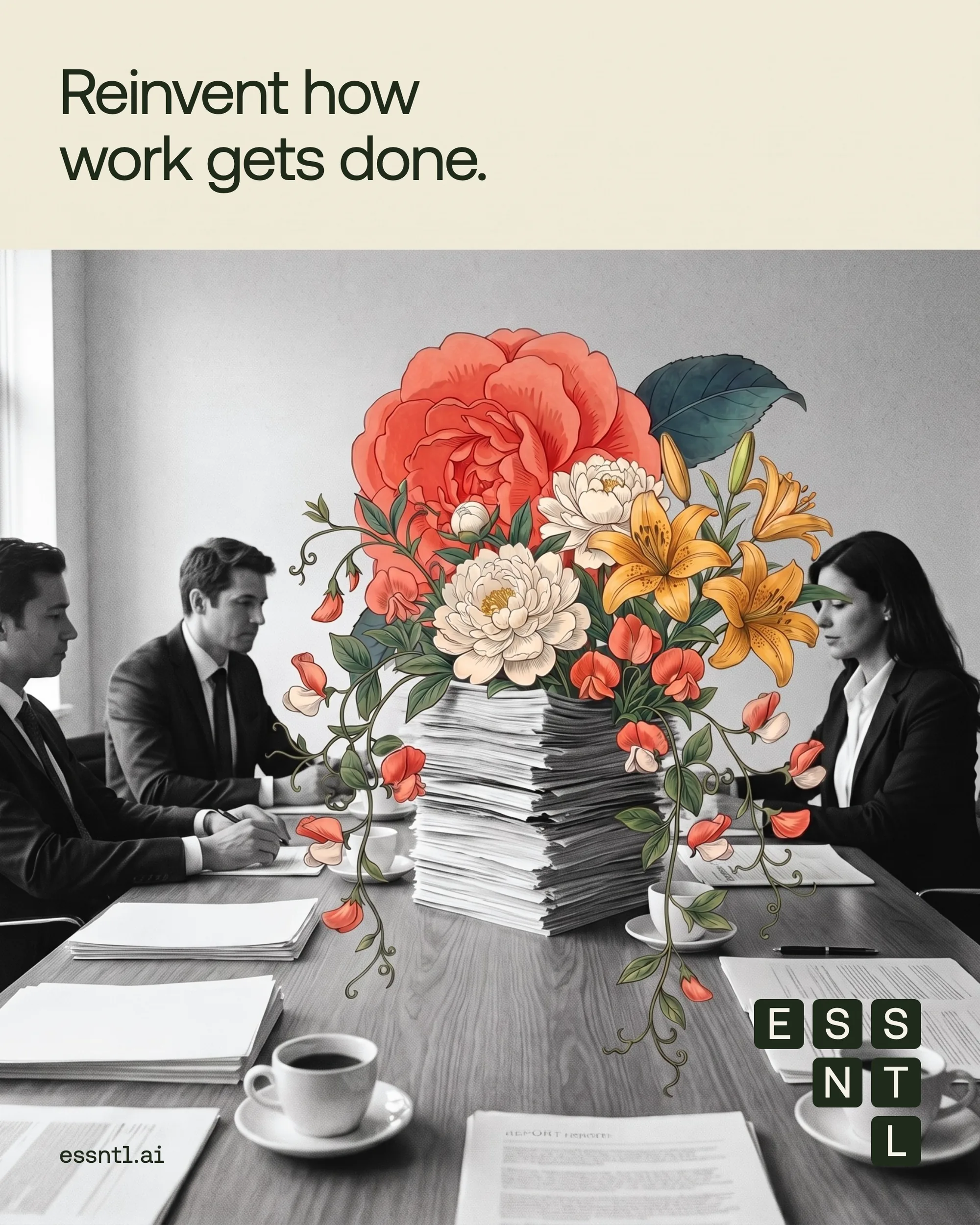
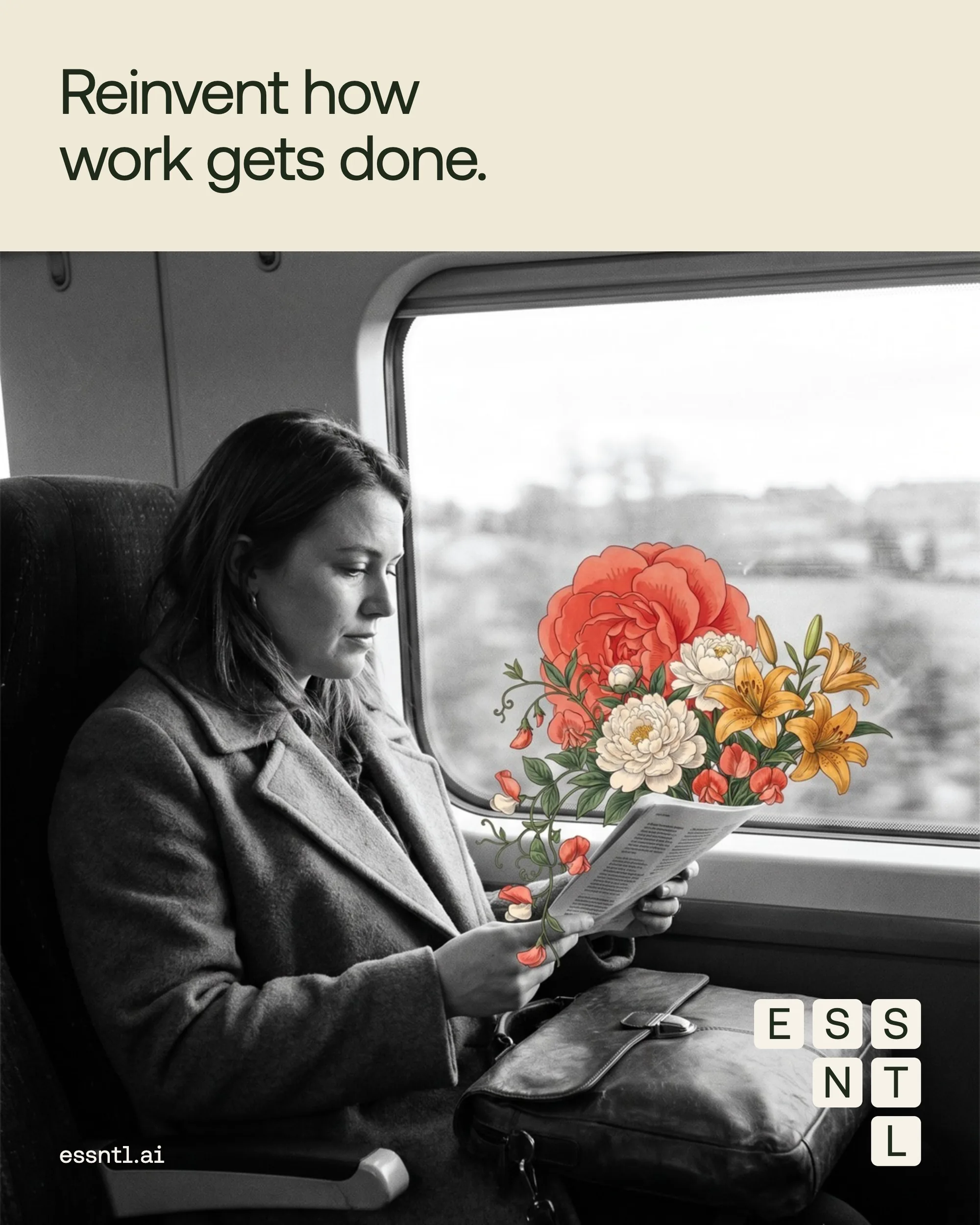
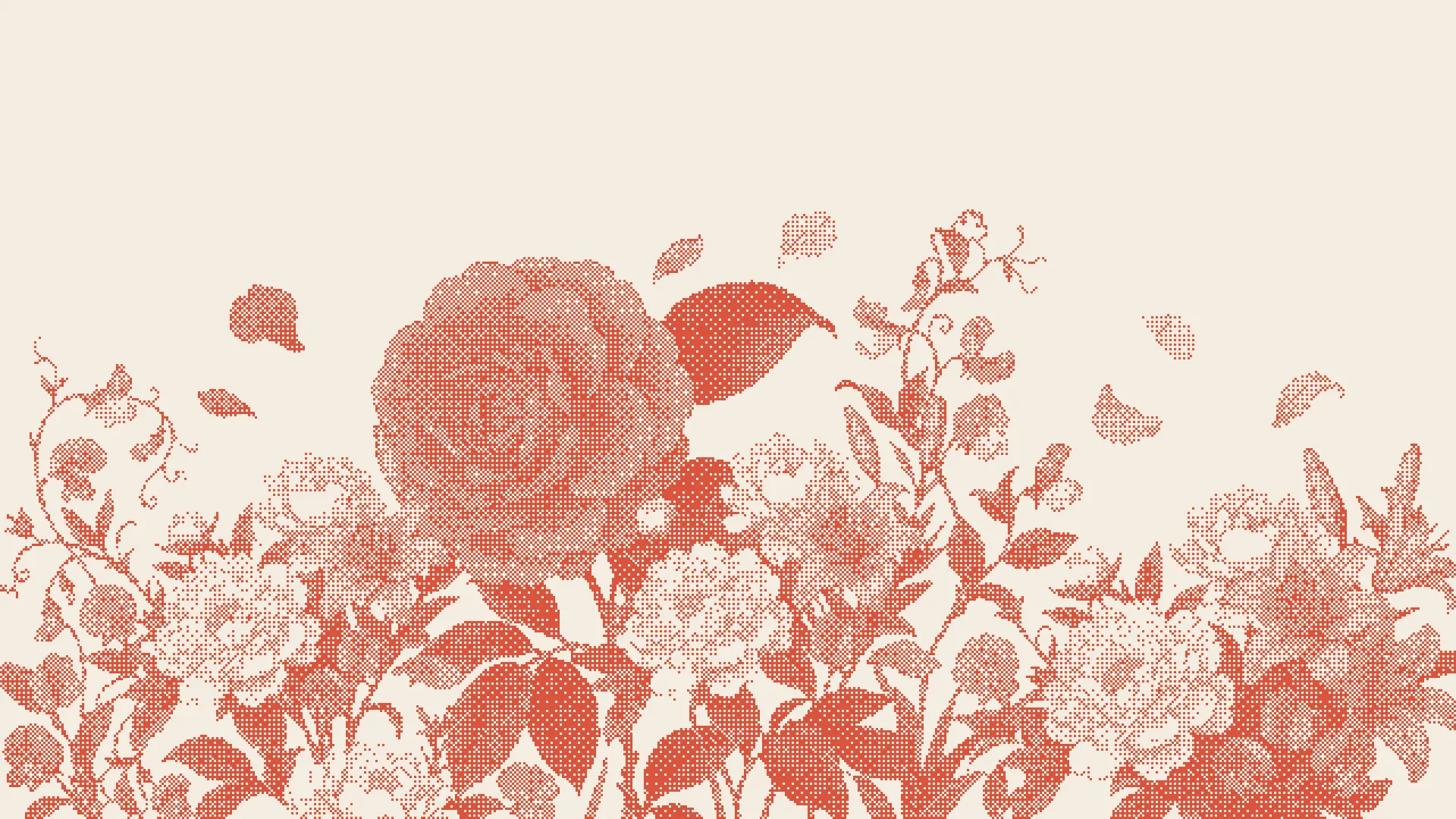
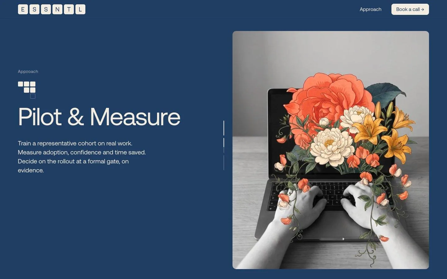
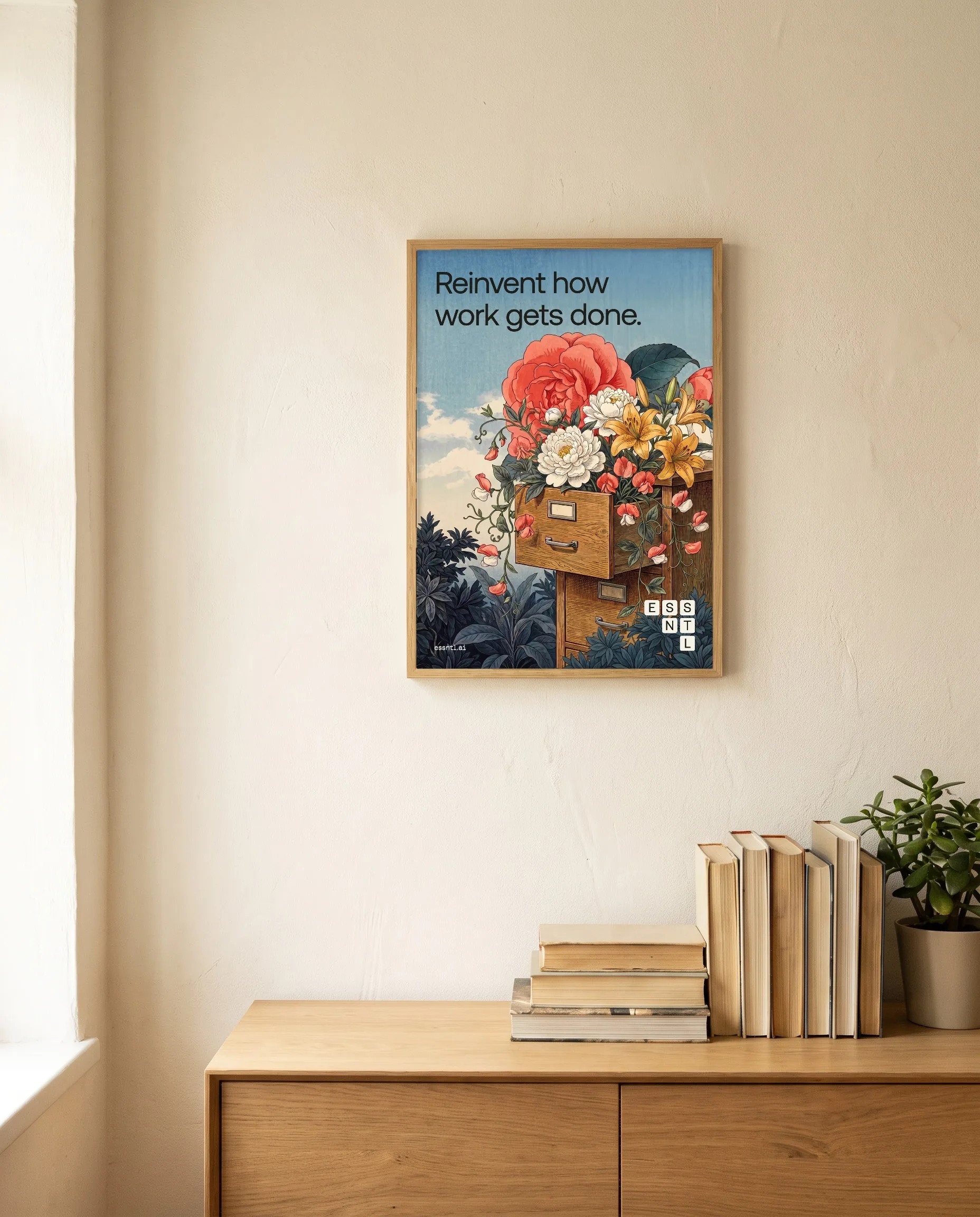
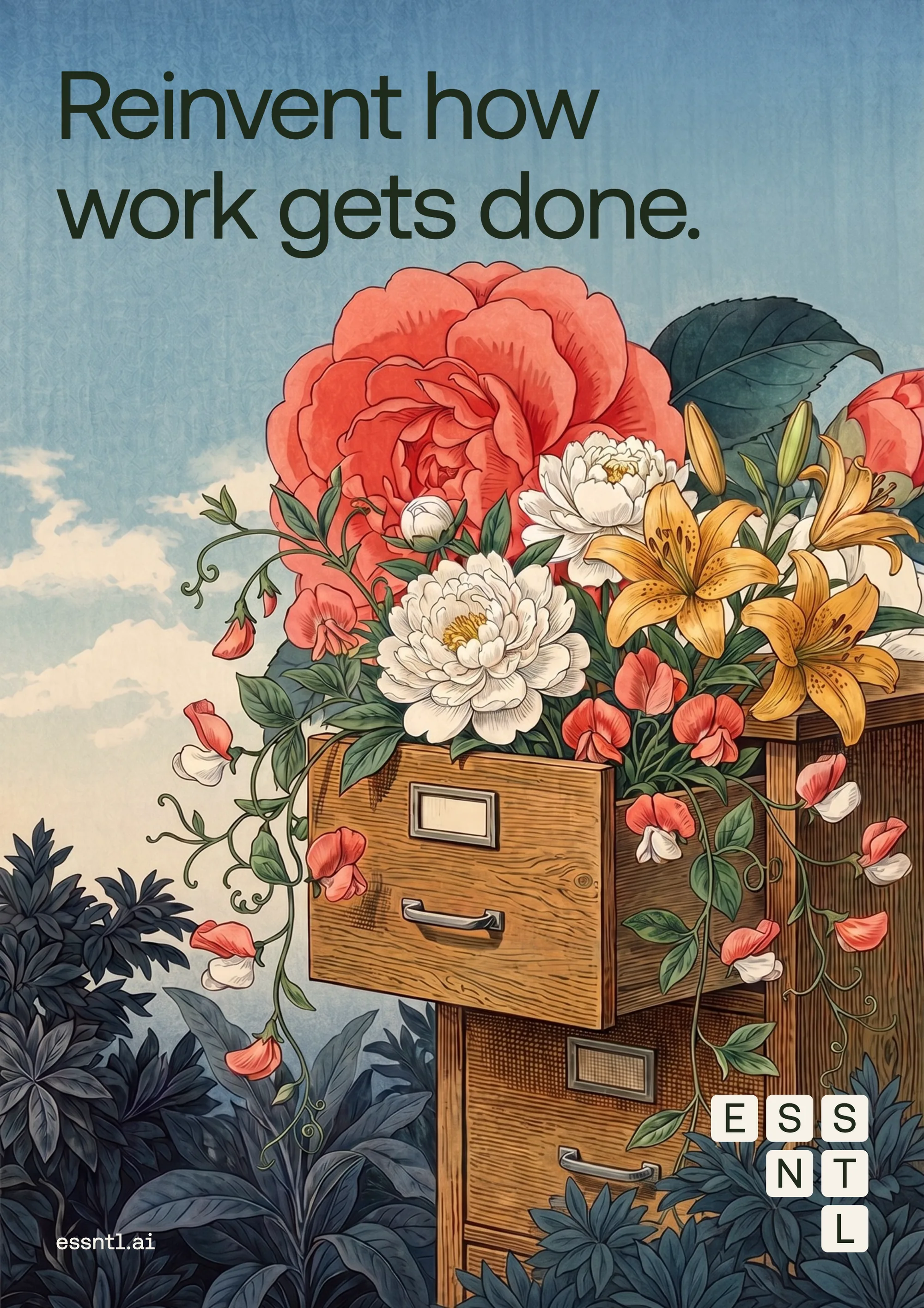
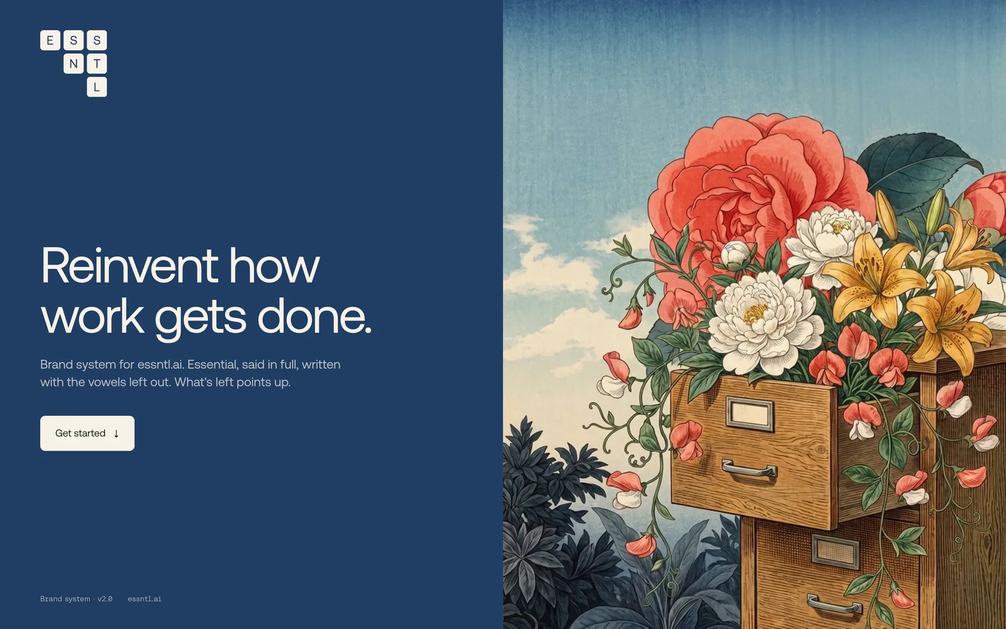
The imagery borrows from Japanese botanical engraving: fine hatched linework, watercolour washes, cream paper. Office things, a filing drawer, an in-tray, a laptop, burst into gardens.
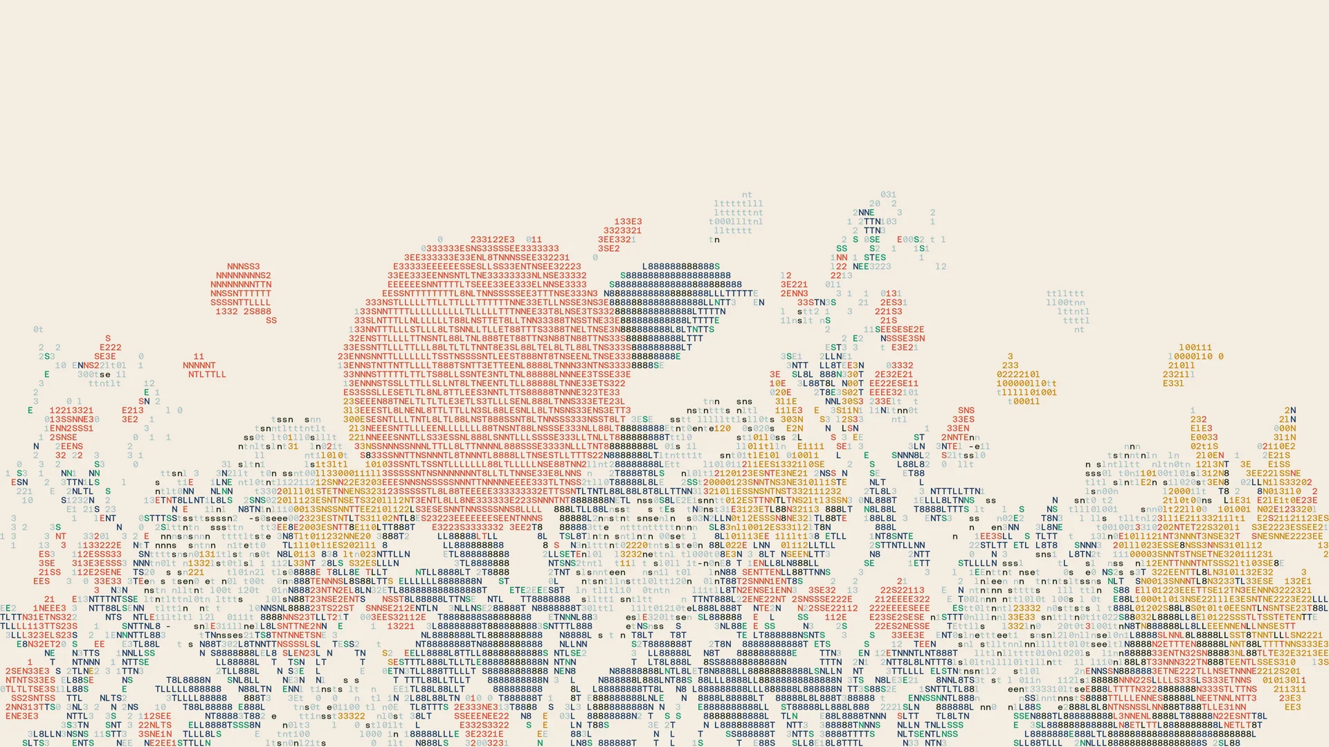
The same flowers grow through black-and-white photographs of ordinary work, and through dither patterns made of letters and numbers.
Motion
Everything moves the way the logo does: split-flap letters, vowels letting go, a garden growing up from the bottom of the frame. One film carries the whole system.
Website
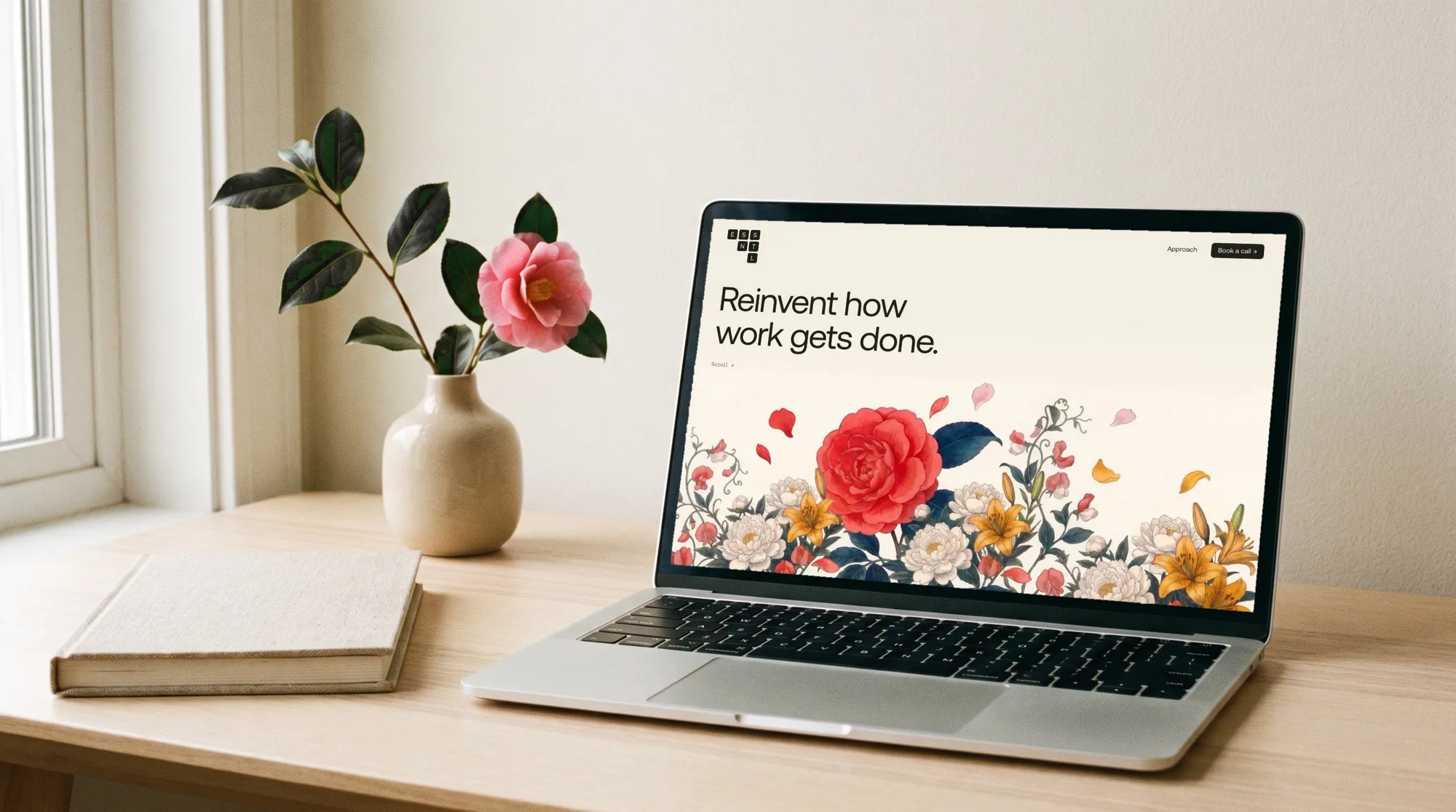
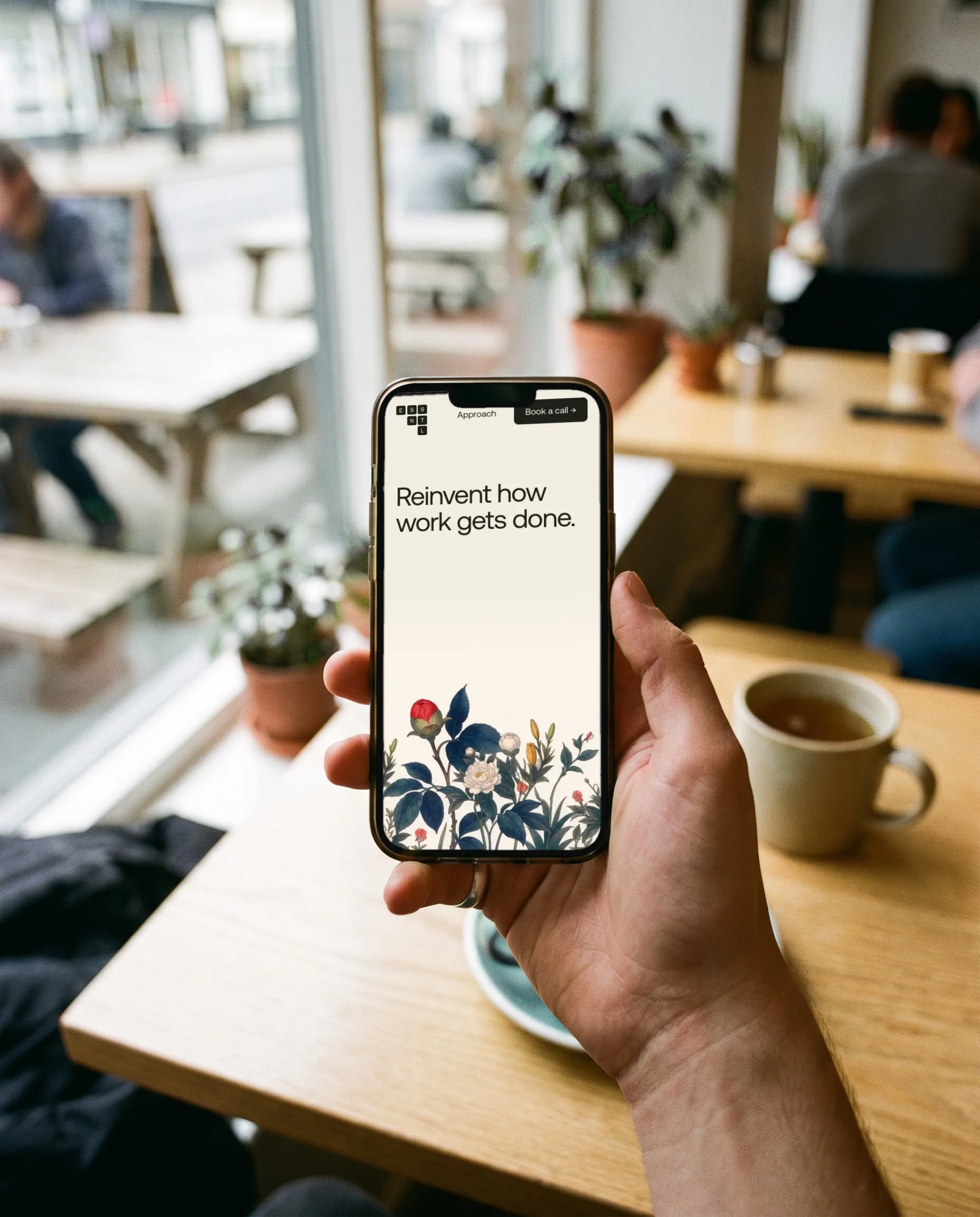
essntl.ai opens on the bloom, then flies through it as you scroll. Approach is an indigo scene: the garden match-cuts on a camellia into the logo block, and each stage gets its own poster.
The header logo folds from square to row as you scroll, and the footer spells ESSNTL in tiles you can tap.
Print and things
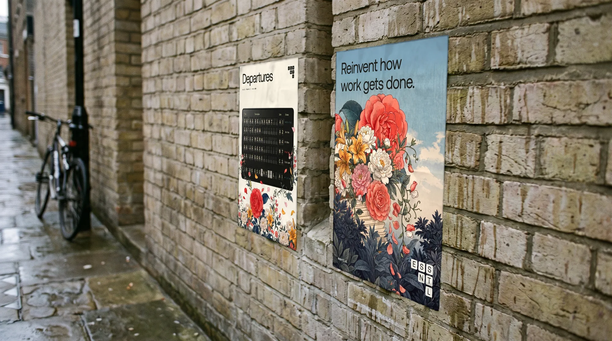
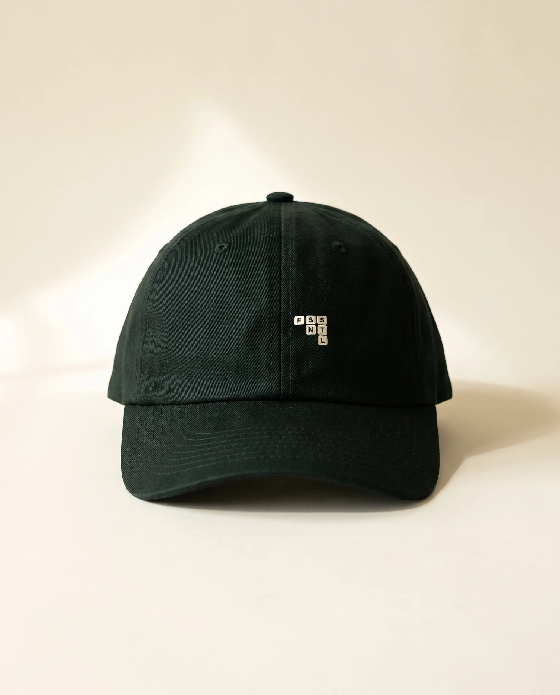
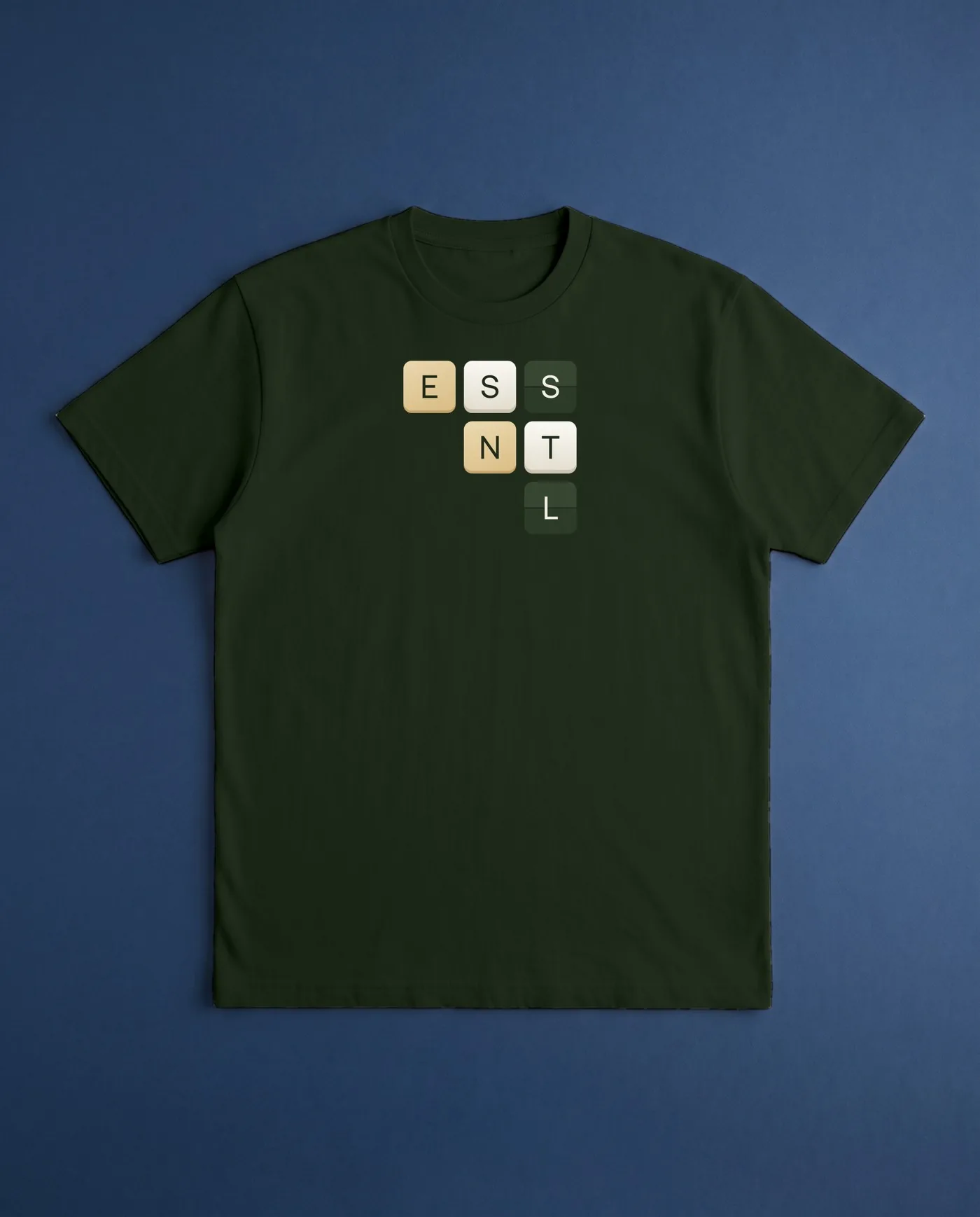
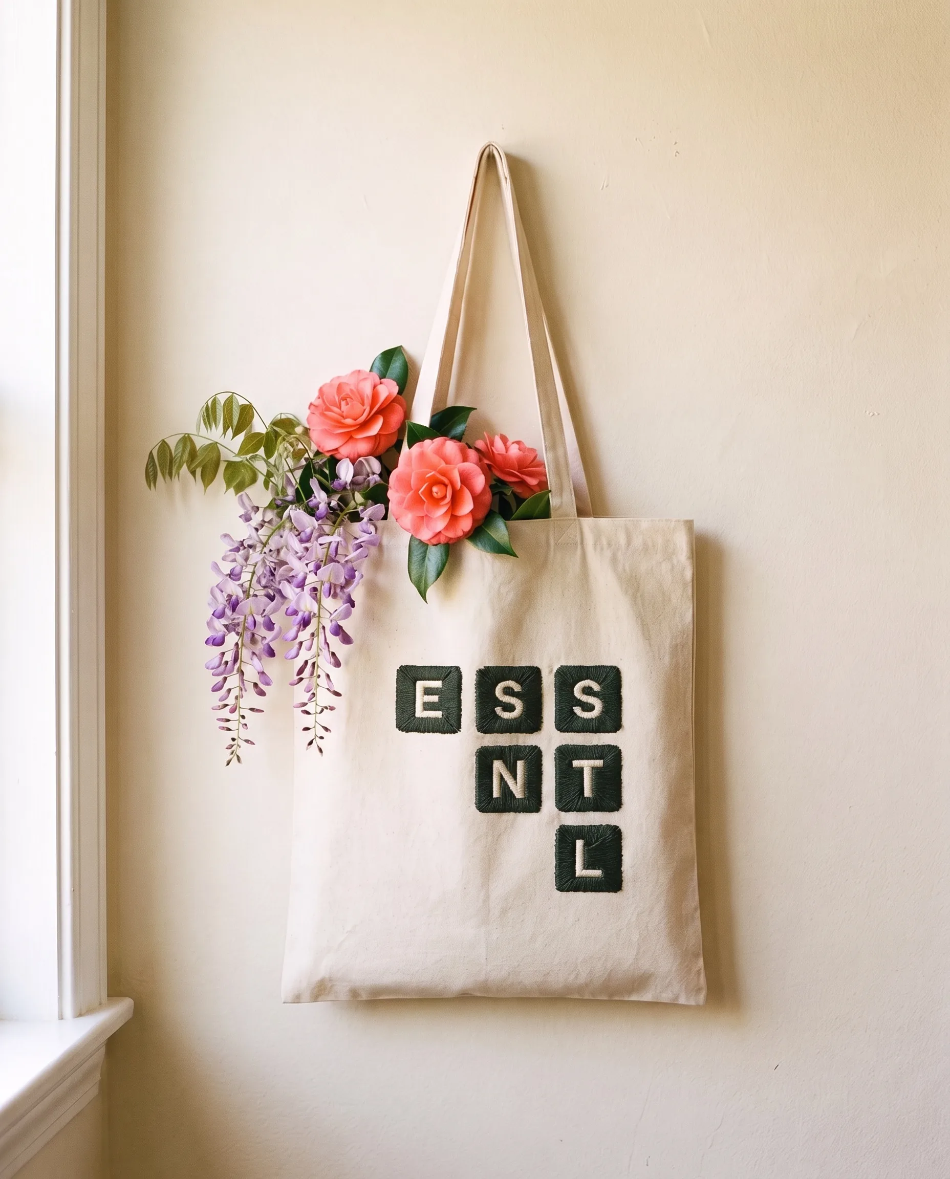
A4 posters, a departures board for workshops, stationery, a brand book, and the things people keep: a cap, a tote, tees and a gift box.
Credits
- Client
- Essntl Ltd
- Our work
- Identity, imagery, motion, website, print